After the past few weeks of analyzing other websites, we were asked to turn inward and analyze
our own User Science Journal for usability using the WAVE (Web Accessibility Evaluation) tool
from last week, as well as Google’s own Lighthouse tool that is included under the ‘Audit’ tab
in Chrome Dev Tools.
I was very interested to find out what the results of these two tests might be, given that this
blog was built using a bootstrap framework provided to us as part of the course, as well as how
the results from each tool might differ. That being said, I was not quite sure what to expect.
The Findings and Fixes
The pages I decided to test were the home page, about page and last week’s blog post Evaluating Accessibility. Out of familiarity from last week, I used the WAVE tool on all 3 and compared the results from each page.In the report for each page, there were only 3 flagged errors for each page which which consisted of empty links in the social media buttons. Truth be told, it was something I noticed but never went out of my way to fix. What better time than the present? I don’t have twitter so I removed that button, but updated the Facebook and Github buttons to have links, alt text and open in another browser.
 Before
 After
After
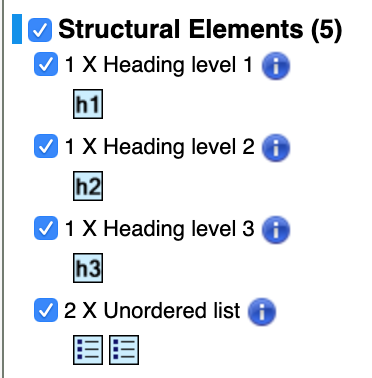
Another call out highlighted the Structural Elements (headings and unordered lists) which recommended to review each element to ensure that it is being used appropriately.

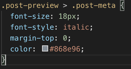
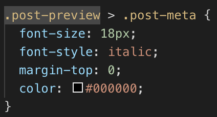
There were also 4 areas that were flagged for having "Very Low Contrast" in the navigation and body section, which I updated the CSS to make the text stand out more.
 Before
 After
After
The next step in the process was to run the Lighthouse audit on the pages and
comparet the results as well to each page and the WAVE results.
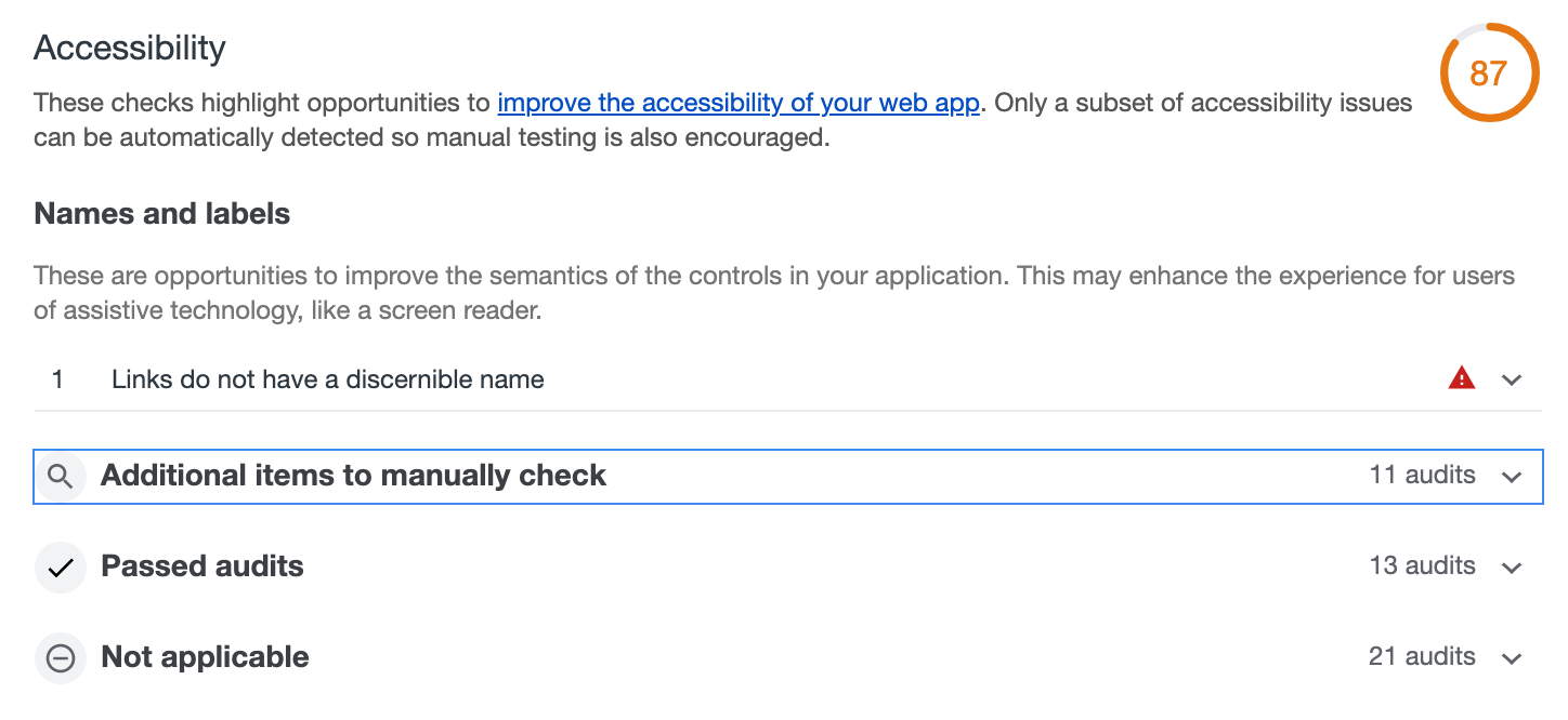
Overall, the pages had accessability scores ranging from 78-87 due to errors such as
missing alt text and contrast issues.
What I enjoyed most about using this tool was that it highlights any errors, then
gives you a very clear list of additional elements to check for compliance with
collapsable descriptions that tells you what to look for. I feel like Lighthouse is
a very thorough and beneficial tool to use.

Conclusion
Completing this assingment helped me to realize that creating accessible sites is not as difficult or intimidating as it may seem, especially with how many tools and resouces are available for developers across the internet. I also found the bootstrap framework to be incredibly helpful in making the site more accessible.